Shopping 2015


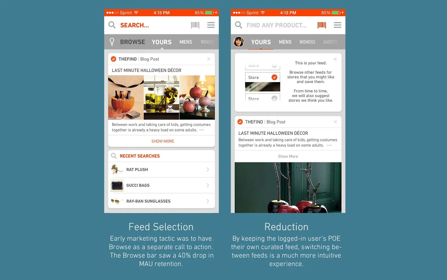
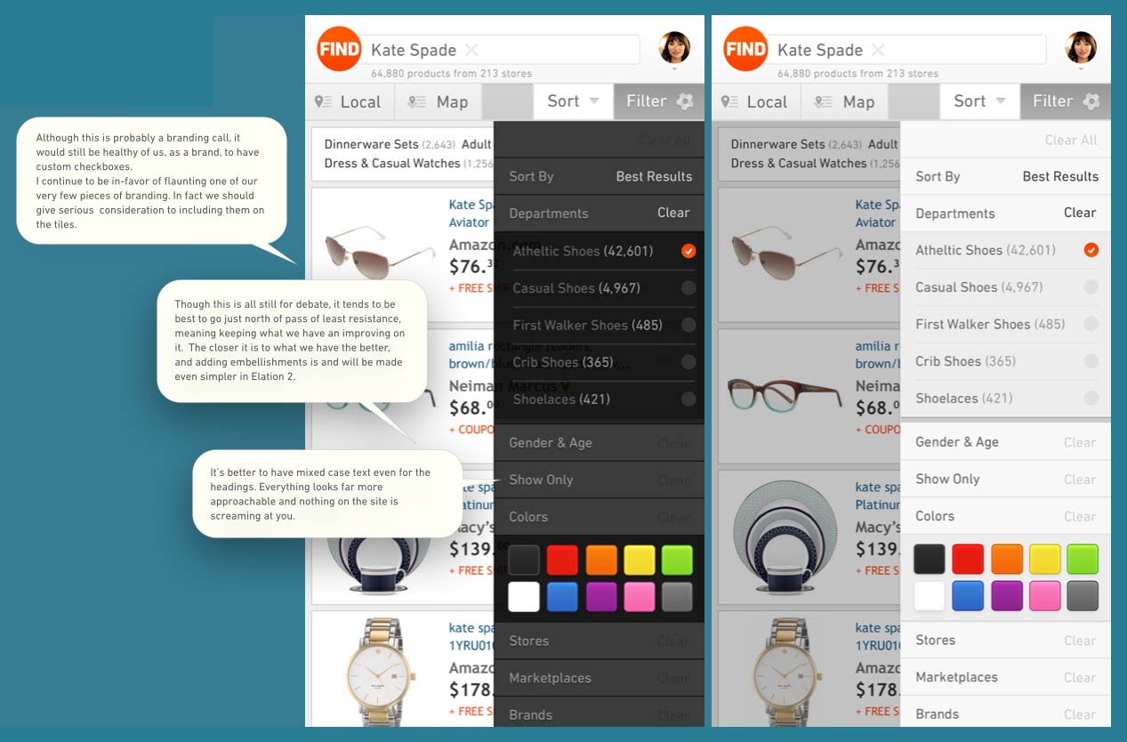
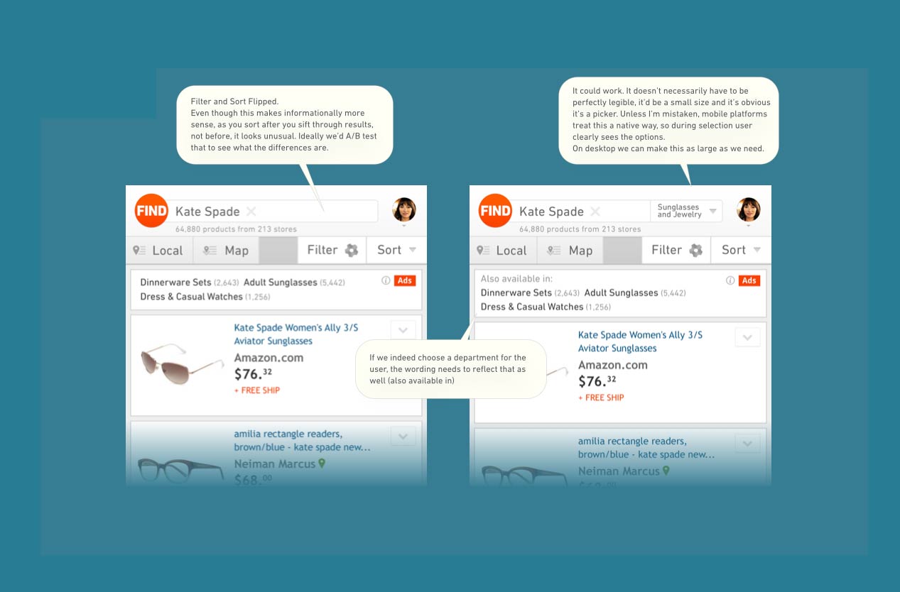
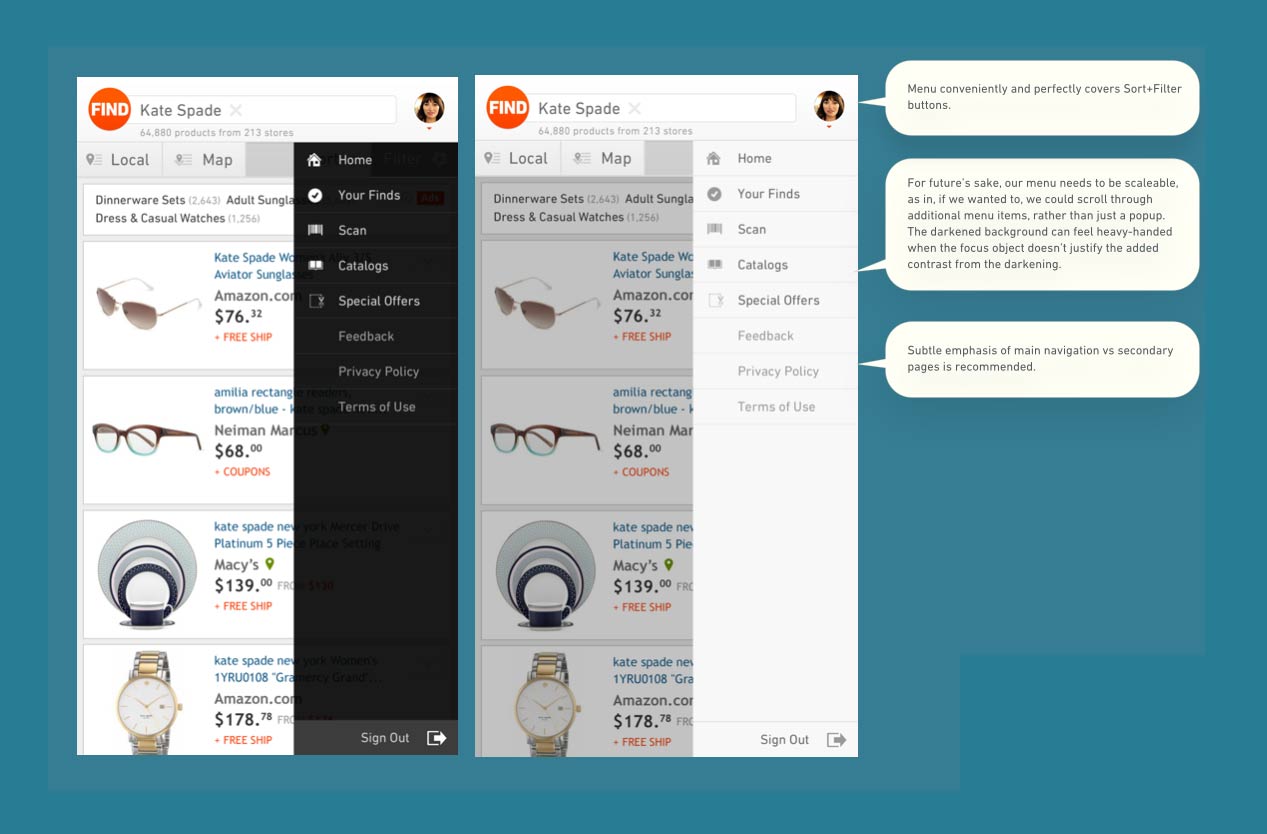
The Find's flagship app has gone trough several years of development, growing outwards in a system of complexity. As complexity grows however, it is constantly necessary to reduce other elements to maintain an efficient UX.


The 2015 version of Shopping (now retired) offered a cleaner implementation of Feeds and SERP pages based on Facebook's own code, capable of handling a large amount of high-res images.

A new deals page incentivized the experience for newly acquired users (through standard user acquisition point of entry) as well as existing ones through customization.

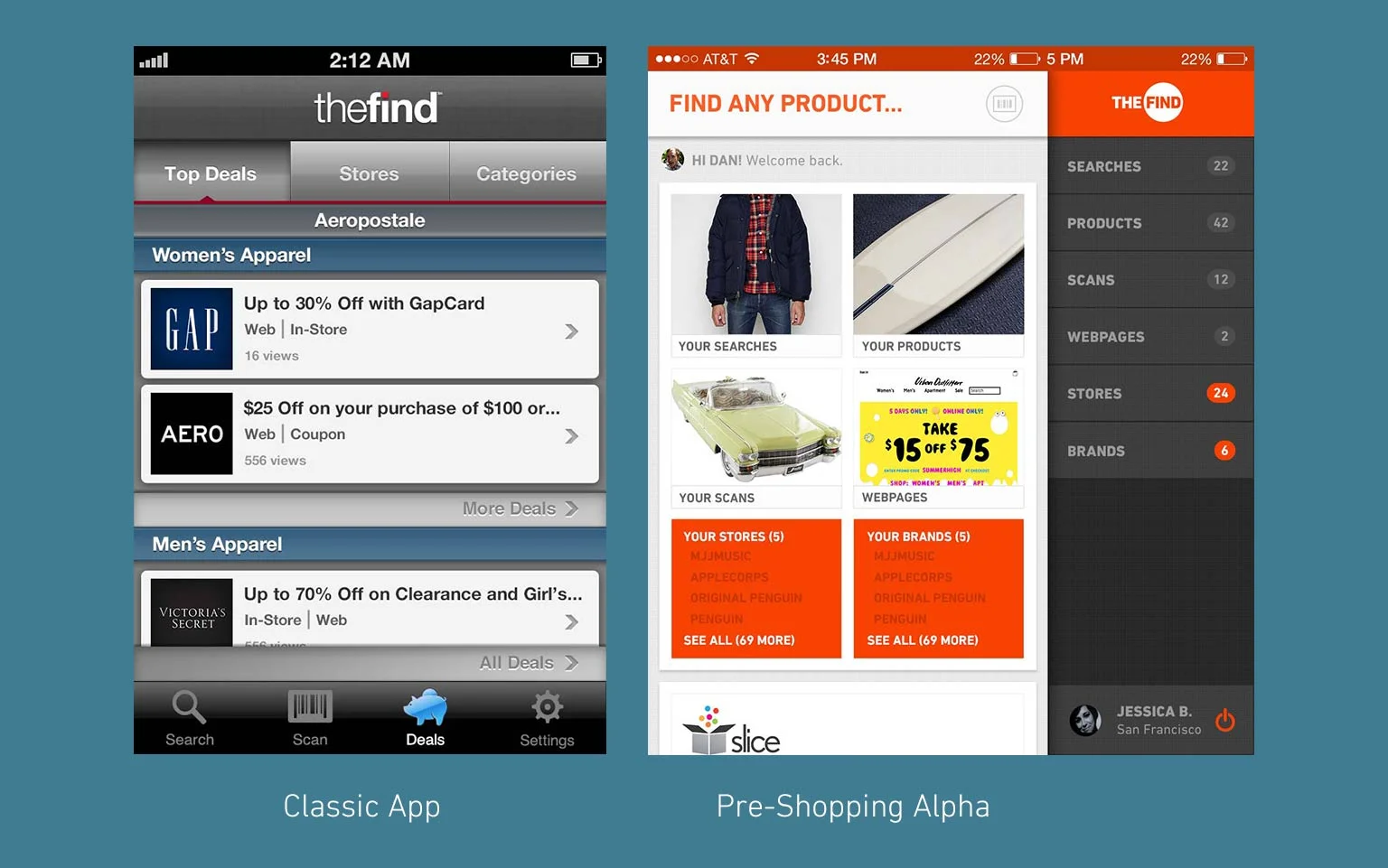
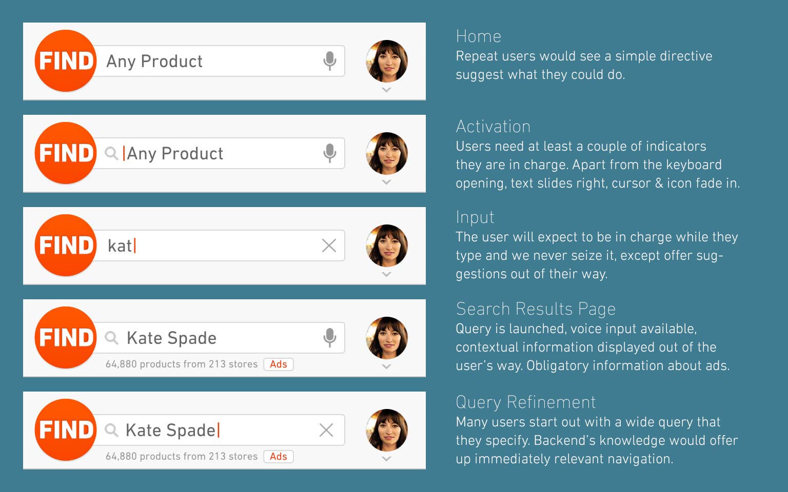
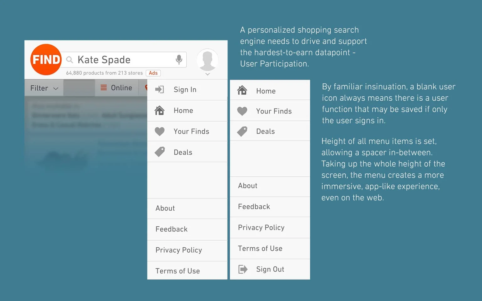
Smart Suggestions brought an across-the-board universal search field. One query could generate Searches for products or even Stores.

A more system-based search bar increased successful query launches, and many  other smaller updates (such as a more standard save/heart button) polished the experience further.


Early Tile Schematic for iPad

Early Tile Schematic for iPad

The Feeds


Add the perfect time-waster to the app - so that people can be consumed in shopping and you've got a sure-shot on your hands if you play your cards right. The concept was simple - display Retailer's facebook or twitter feed, based on which one offers more clickthrough links (or both) to keep users immersed.

The result was astonishing even in the early builds - but the final metric took the session time from under half-minute to astonishing 3.5 minutes, twice the industry standard. Combine such immersion with properly placed deal/product placement such as "You might like these products" and you've got a way in.

Responsive Web Overhaul


Browsers spearhead the extent of what’s possible for a website to do. If browsers were perfect, every website could be an app. Fortunately,  the surge in mobile devices have put a modern high-powered browser in every consumer’s hands.

Due to browser limitations, the Viability of a true app-like experience on a mobile website was low until relatively recently.. Even now, the scope of what’s possible is limited by more than just the vision of what the product could or should be.

So while TheFind’s mobile experience gained more and more users, a native experience became integral to gather a more engaged audience; to step away from a simple utility for finding products conveniently to becoming a household name for all-things online shopping.


Communication is Key


I like to combine UI and UX, because they affect each other in a symbiotic way. Because of this, the most efficient way to communicate ideas and feedback into designs is to keep a running set of mock-ups and annotate them properly to illustrate the design's intent as clearly as possible.


Below are several examples of interdepartmental PDF mail-outs regarding development and up-to-the-hour feedback incorporation.


Glimpse and Catalogs

The first product I came into contact with when working with The Find was Catalogue. At the time it was the market leader on digital catalogs in the iOS app store, offering not only the widest lump-sum of catalogs both available and unavailable in PDF form and even allowed users to shop directly from within.

Initially the company wanted to only skin their existing app to be more in-line with their up-and-coming project - social-based shopping webapp called Glimpse. The back-end crawled product pages weren't brimming with wealth of FB-Like data, but what data was available was very much embraced by an immersed audience. Glimpse's most important contributions however, were Catalogs. Not only the same data as in the legacy iPad app, but custom, user-curated catalogs allowed people to engage and create their own, special shopping wish-list.


Catalogues in Shopping for Droid

As mentioned previously, although the Catalogue app was decommissioned in 2013 to give Glimpse more spotlight, the core function never went away and was present until the very end in the Shopping app for Droid.


Below are some late examples of interdepartmental PDF mail-outs.

 
Thanks for viewing my work. Want to get back?